87%
Drop in net bounce rate
42%
Increase in activity starts
50%
Users started via one element
Overview
Level SuperMind is a mental wellness app helping users build healthier habits through meditation, music, sleep content and guided journeys. The Music section is one of the highest-intent entry points in the app — users who land there are actively looking to start a session.
Despite having a wide library of curated tracks, ambient soundscapes, and focus playlists, the section was seeing poor engagement and a high drop-off. I was assigned to lead the redesign — and what started as a single page fix ended up becoming a layout pattern we rolled out across the entire app.
If you've ever opened an app, felt overwhelmed by the options, and just closed it — that's exactly what was happening to our users.
The Problem
The Music section had a 38.2% drop-off rate
The business team noticed that a large number of users were landing on the Music section and leaving without starting a single activity. The average drop-off rate in wellness apps sits between 20–30%. At 38.2%, we were well above that — and losing premium users at 36.4%.
Why is the problem significant?
The Music section is one of the most visited parts of the app. High drop-offs here meant users weren't building the daily habits the app is designed around. Every user who left without starting a session was a missed chance at retention and engagement — the two metrics that matter most for a subscription product.
What did users say?
We combined behavioral data with user interviews to understand why people were leaving. The feedback kept pointing at the same thing.
I don't know where to start
There's too much to scroll through
I can't find the type of music I want quickly
The banners look clickable but they don't do anything
Why the existing experience didn't work
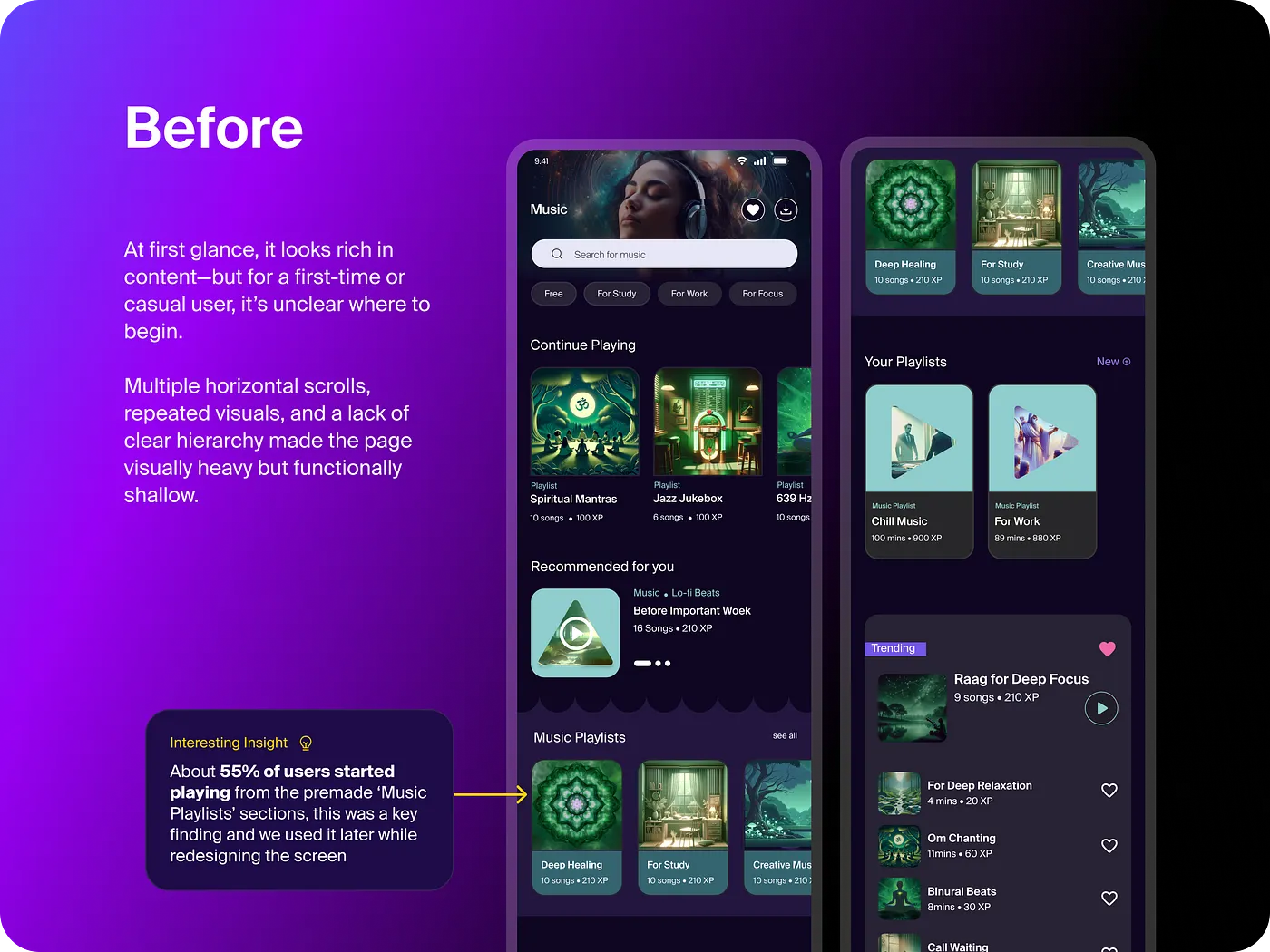
The Music section hadn't had a meaningful redesign since it was introduced. The layout relied on multiple stacked horizontal carousels — a pattern carried over from the rest of the app. While it felt familiar, it created real friction: users had to swipe sideways through several rows just to evaluate their options, with no clear indication of where to begin.
One insight from the data stood out: 55% of activity starts were coming from the premade Music Playlists section. Users weren't exploring — they wanted a shortcut. The design wasn't giving them one.
The content was genuinely good. Users just never got far enough to experience it. That gap between value and discovery was the real problem.
Understanding the Problem
Three core issues kept surfacing
1
No clear entry point
Everything on the page competed for equal attention. There was no visual hierarchy, no obvious "start here." Users had to make a decision before they'd even started exploring.
2
Horizontal carousel overload
Five stacked carousels meant users had to swipe left through each row just to see what was available. It wasn't browsing — it was work. And most users gave up before finishing the first row.
3
Banners that didn't do anything
Prominent banners sat at the top of the page but weren't tappable. Users expected them to be interactive — when they weren't, it broke trust and added confusion.
Hypothesis on shortcomings
🎯Users should have one obvious starting point the moment they land on the page
🔎Users should be able to filter to the type of music they want in one tap, not five swipes
💡The featured banner should be the highest-engagement element, not decoration
📱The layout should match how people naturally scroll on mobile — vertically, not horizontally
🔄The banner should stay fresh and relevant each time a user returns
The Strategy
Four ideas to solve the problem
After sprint sessions with the PM and senior designer, we aligned on four strategic changes. The goal wasn't to redesign everything — it was to reduce friction at each decision point.
🏆
Featured Banner as entry point
Give users one obvious starting choice at the top of the page. Applies Hick's Law — fewer options at first glance means faster decisions.
🏷️
Filter tags over carousels
Repurpose existing Music Playlist categories as filter tags. Users narrow down what they want in one tap instead of scrolling through five rows.
📜
Vertical scroll layout
Switch from horizontal carousels to a single vertical scroll. Remove track descriptions that were adding cognitive load without aiding decisions.
🔄
Dynamic featured logic
The banner rotates to show a new track every time a user plays music — keeping the experience fresh without requiring any manual curation.
Some weeks the Figma file looked worse than when we started. That's just how good design works — you have to sit with the mess before the clarity comes.
The Designs
Iterating toward clarity
The process moved in loops — brainstorming to wireframes, wireframes to reviews, reviews back to the drawing board. The first version was cleaner but still had gaps. It wasn't one big change. It was a dozen small ones, each one reducing friction a little more.
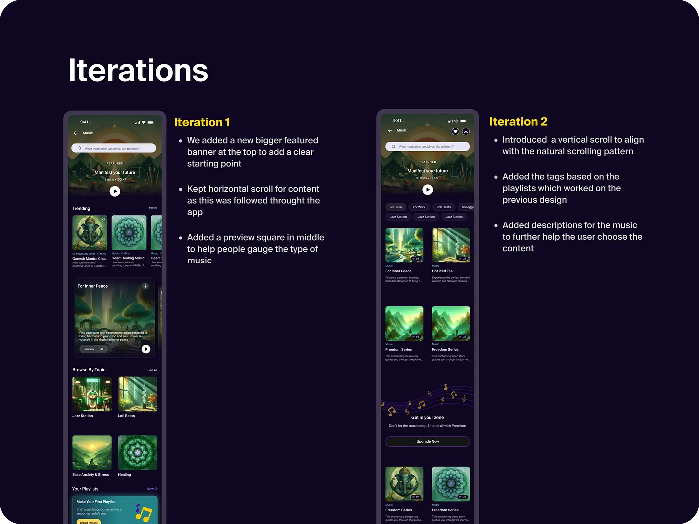
Iteration 1: Added a larger featured banner at top. Kept horizontal scroll — still familiar to existing users.
Iteration 2: Switched fully to vertical scroll. Introduced filter tags from existing playlist categories. Removed track descriptions.
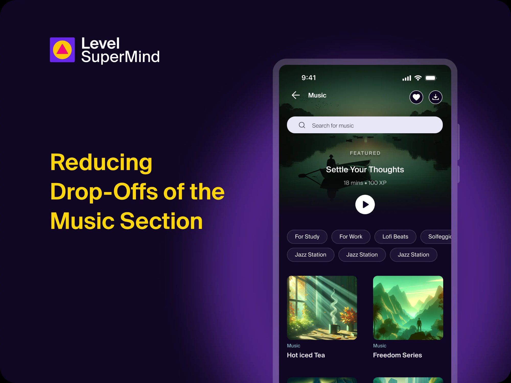
Final Design
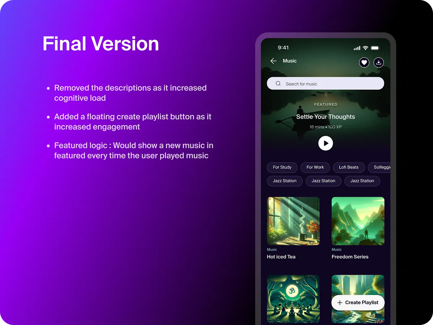
The final design stripped back everything that wasn't directly helping users get to a track faster. A clickable featured banner at the top gives users one immediate starting point. Filter tags let them narrow down by mood or category. A vertical layout removes the effort of sideways swiping. A floating "Create Playlist" button surfaces at the right moment for users who want to go deeper.
View Music Prototype
We almost shipped a version that still had descriptions in it. One more review round saved us. Sometimes the best design decision is just removing something.
Scaling the Pattern
We applied the same framework to Sleep
The Sleep section offered paths, but no priority — and that cost us in engagement.
Before the redesign, the Sleep experience was fragmented across three separate sub-pages — Sleep Music, Sleep Meditations and Sleep Stories — each with its own layout, filters and structure. Users had to remember where everything lived and navigate between pages to find what they wanted.
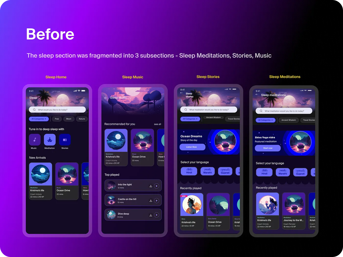
3 separate sub-pages, each with different layouts and navigation. Users relied on memory to find content across Meditations, Music and Stories.
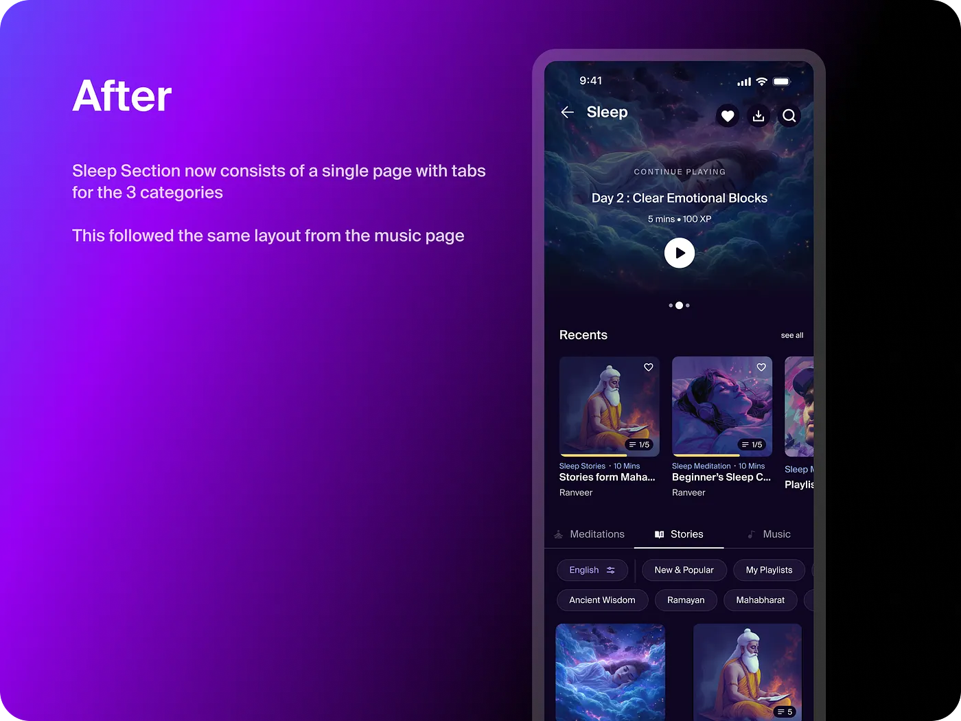
Everything on one page. Same banner + filter tags structure as Music. Personalized modules like "Recents" and "New & Popular."
17% drop-off reduction in Sleep
View Sleep Prototype
After Music, the question wasn't whether to apply this to Sleep — it was how fast. The layout worked because it matched how people actually scroll on their phones, not how we assumed they should.
Impact and Learnings
The overall impact was significant
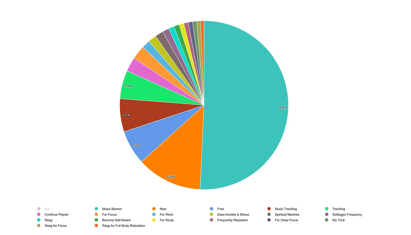
The featured banner became the single most clicked element in the section — accounting for nearly half of all activity starts. More than just improving the numbers, it validated the core hypothesis: when you give users one clear starting point, they use it.
5%
Net drop-off after redesign
38.2%→5%
10%
Premium user drop-off
36.4%→10%
1.7
Activity starts per user
1.2→1.7
50.8%
Of all starts via the banner
Most clicked element post-launch
17%Drop-off reduction when pattern applied to Sleep section
55%Users who were already starting from Music Playlists — the key data insight that shaped the redesign
I'll be honest — even I didn't expect the numbers to move this much. But when you reduce decision-making load at every step, it compounds. The data just made it visible.
Learnings
What this project taught me
🗂️
Hierarchy drives action
A clear starting point reduced drop-offs more than any personalisation feature could. When users know where to begin, they begin.
📊
Let the data point the way
The 55% stat — users starting from Music Playlists — was the insight that unlocked the whole redesign. We didn't invent the solution; the data told us where to look.
🔁
Good patterns scale
The same layout worked across Music and Sleep because it matched how people naturally scroll on mobile — not because it was a clever design move.
🧠
Get out of the user's way
UX isn't about impressing anyone. It's about understanding people well enough that the design becomes invisible.
It was surprising to see a small change have such a large impact — but looking back, it did make the user journey much simpler and reduced decision fatigue. Sometimes that's all it takes.